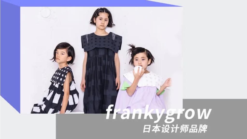

Checkerboard was first used on the flags in car racing for its clear black-white tone, which was later appeared in the skateboard culture. Through the reinterpretation of brands, checkerboard has been more daily and high-street. The combination with Op Art geometric shapes penetrates into the inner senses to create spatial layers and capture the orderly effect. Distorted shapes and color changes awaken the playfulness of old-time Amusement Park.

“Interpretation” is a word with endless energy, which includes various kinds of modern arts and forces fashion labels to attempt the aesthetics that subvert the tradition. When amusement park meets an era of information, a new entertainment spirit has been emerged. Contrasting bri-ghts are widely used to form intense visual impacts.

Checkerboard elements are integrated into the background of amusement park through Op Art. The colors of checkerboard are combined with building blocks to develop the color perception and stimulate the visual logic. To meet the festivals in autumn and winter, the entertain-ing theme transfers the monotony of checkerboard and displays playful kidswear.

Extravagant elements are widely used in this theme. Large sweet bows, exaggerated ruffles, and 3D curved pockets break the visual fatigue and bring newness. Colored patches and color blocking are also shown to strengthen the playfulness. Besides, we can also see clown’s collar, ruffled sleeves, shirt collar and pleats on undershirts.

For a full report, pls visit https://www.popfashioninfo.com/details/report/t_report-id_11787-col_21/